
User onboarding and authentication are some of the most common user journeys and often the most abandoned and frustrating for users. They are a user's first impression of your app, so it's crucial to make it welcoming with a convenient and trustworthy experience. Whether designing for login, user registration, or an onboarding walkthrough, the following guidance is here to help you create an ideal experience.
Takeaways
- Create an amazing onboarding experience.
- Use available libraries, like passkeys, for user trust, familiarity, and convenience.
- Collect only critical user information.
- Use clear and assistive language.
- Organize and explain the value of features and reasoning for permissions.
Get started
Collect: Think about what your user needs to set up, learn, and authorize.
In-app versus upfront: Separate everything into what needs to be accomplished before using the app opposed to while using the app. Avoid creating friction for your users to start engaging with your app's content. Consider if the content and interactions are better as a prompt or as an educational moment.
For in context elements, provide an explanation and action if applicable.
For steps and education that is crucial to finish before using your app, organize into logical steps. Typically you will need to show the value of the app before asking for device permissions or to create an account. Always follow the value proposition with the action.
If your app requires an account of some sort, decide on authentication methods. Passkeys can alleviate user's concerns and friction with account management.
Provide recovery methods.
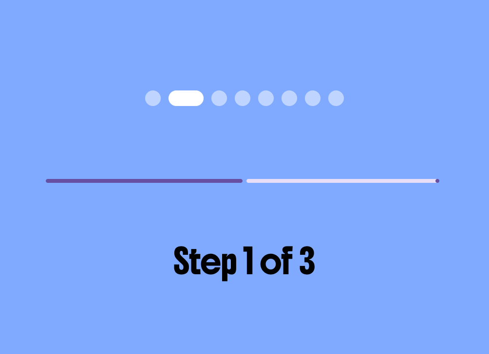
Show the user's progress. You can use components like steppers, pagers, or a progress indicator.
User journeys
Exceptional onboarding creates a sense of accomplishment and has a distinct personality. It helps users find their way with clear signposting patterns to set up their experience, grant permissions, and feel their progress, all while engaging with your app's brand and concepts.
Entry point placement
The welcome placement preloads all user education and app setup up front. This approach is ideal when your app requires user registration to gain access to content, when previewing content is not possible, or when in-context learning is not suitable. The primary advantage is that users are immediately aware of how to use the app and gain full access sooner. However, a significant disadvantage is the higher risk of losing users before they experience the app, though this can be mitigated by providing some initial awareness of content as shown in the following image.

Contextual, or just-in-time in-app, onboarding allows for greater flexibility regarding content awareness, registration, and learning. It enables patterns like permission priming, where requests are made at the specific time of need. This is best used when you want to provide a preview to entice sign-ups or when you prefer to break up registration and education into smaller, more memorable, and manageable steps. This also allows the user to learn while doing and greater chance of retention.

Registration / Sign up
The registration, or sign up, flow helps users create an account for your app. Consider if your app needs to register users upfront to use or if they can access a certain level of content and features.
To optimize the registration flow, collect only the minimum information needed upfront, such as email and password, or combine steps to reduce friction. Capturing only essential properties like a username for verification avoids overwhelming the user with options. For longer processes, break them up into multiple screens, but don't overdo it with only one input per screen. Ensure password requirements are clear and logical.
Sign in / Login
Returning users need a way to sign back into their account. Sign in should be fast and unobtrusive. If your app only requires authentication for accounts, consider combining a registration and sign in through a single sign on method.

Effective login journeys should prioritize user convenience by implementing modern authentication patterns. This includes offering biometric prompts and auto-fill capabilities to reduce the cognitive load and manual entry required from the user.

Onboarding walkthrough and customization
Before implementing a full walkthrough, critically evaluate if your application truly requires one. Often, complex features can be introduced more naturally through subtle motion cues or in-context tooltips that don't disrupt the user's initial flow.
If device permissions are necessary, use "permission priming" to explain the value of the access requested. This is most effective when done at the specific moment of need rather than as a bulk request at the start of the app experience.


Do

Don't
When pitching app features to entice sign-ups, consider if a preview of real content would be more persuasive than a series of static interstitial slides. If you do use a walkthrough, always ensure there is a clear and persistent option to skip or login immediately.
Provide a way to skip and resume later, like caching progress. Providing a way to save creates a checkpoint, so users are more likely to pick up where they left off rather than abandon altogether. Always clearly communicate what will happen with any progress to reassure users.

Visual signposting through the use of steppers and progress indicators helps set user expectations. These elements provide a clear sense of how many steps are remaining, reducing the abandonment rate during longer onboarding or setup processes.
Do

Don't
Recovery
Recovery flows should be designed with empathy and respect for user privacy. Never only assume a happy path through any account flows. Ensure that users have clear paths to fix errors without frustration.

Do

Don't
If your app requires a specific username, provide methods to help them remember or reset it with ease.

Do

Don't
While pre-filling certain fields like an email address can be convenient during registration, sensitive information like passwords should never be pre-filled during a retrieval or reset process. Always default to masking sensitive input to protect user privacy in public spaces.
SSO / Passkeys
Integrating with established libraries like Passkeys and Single Sign-On (SSO) providers enhances trust and provides a seamless, familiar experience. These systems allow users to leverage existing security hardware and credentials for a frictionless entry into your app.
Layouts and components
When designing authentication forms, it is essential to utilize containment by grouping like and related entries together, such as placing the "first name" and "last name" fields in close proximity. Doing so helps to design for flexible layouts that can reflow.

Avoid creating long, scrolling forms, which are a major source of user frustration.
Before including any input field, critically assess if the information is truly necessary. If a user accidentally backs out of an extensive form, requiring them to re-enter exhaustive information can lead to high abandonment rates.

Do

Don't
Expanded layouts
When adapting layouts for expanded or landscape views, designers must ensure that the user interface remains usable and aesthetically pleasing. Specifically, avoid stretching interactive components like buttons across the entire screen width, as this can look unnatural and decrease usability.
Instead, continue to use containment principles, setting a maximum sensible width for form elements and content blocks to maintain readability and visual balance across larger displays.

Don't
User education components
When introducing users to new features and onboarding, multiple components are available to use. Rich tooltips and dialogs can help highlight feature discovery and educate users within your app. Sheets can provide an interstitial state to present onboarding and educational content.

Other form factors
Onboarding can include device handoff for cross-form factor and extended app use.
The mobile app experience can provide a more ergonomically convenient way to manage authentication, so onboarding can come from other form factors. For example, a user can complete login on their mobile device that initiated on a Google TV app.
If your app has extended activities on other form factors, like AI Glasses or Wear OS, provide discovery prompts and user education to onboard your users. Learn more about designing AI glasses onboarding experiences.
UX Writing
Use non-intrusive feedback mechanisms like Snackbars and Toasts to confirm user actions or provide brief status updates. This ensures the user feels informed about the system state without requiring them to dismiss modal dialogs for minor feedback.
Tone
The tone of your writing during errors is critical; avoid language that mocks or frustrates the user. Use clear, assistive, and encouraging copy that focuses on the solution rather than the mistake, especially during high-stress moments like password recovery.
Resource
Discover onboarding templates, user flows, and user education assets in the Android Onboarding Figma Kit.