
正規化レイアウトは、さまざまなフォーム ファクタで最適なユーザー エクスペリエンスを提供し、さまざまな用途に使用できる実証済みのレイアウトです。

正規レイアウトは、小画面のスマートフォンのほか、タブレット、折りたたみ式デバイス、ChromeOS デバイスにも対応しています。マテリアル デザインのガイダンスに基づいたレイアウトは、見た目の美しさと機能性を兼ね備えています。
Android フレームワークには特化したコンポーネントが含まれていて、簡単かつ確実にレイアウトを実装できます。
正規化レイアウトを利用することで、生産性を高める魅力的な UI を作成し、優れたアプリの基盤を構築できます。
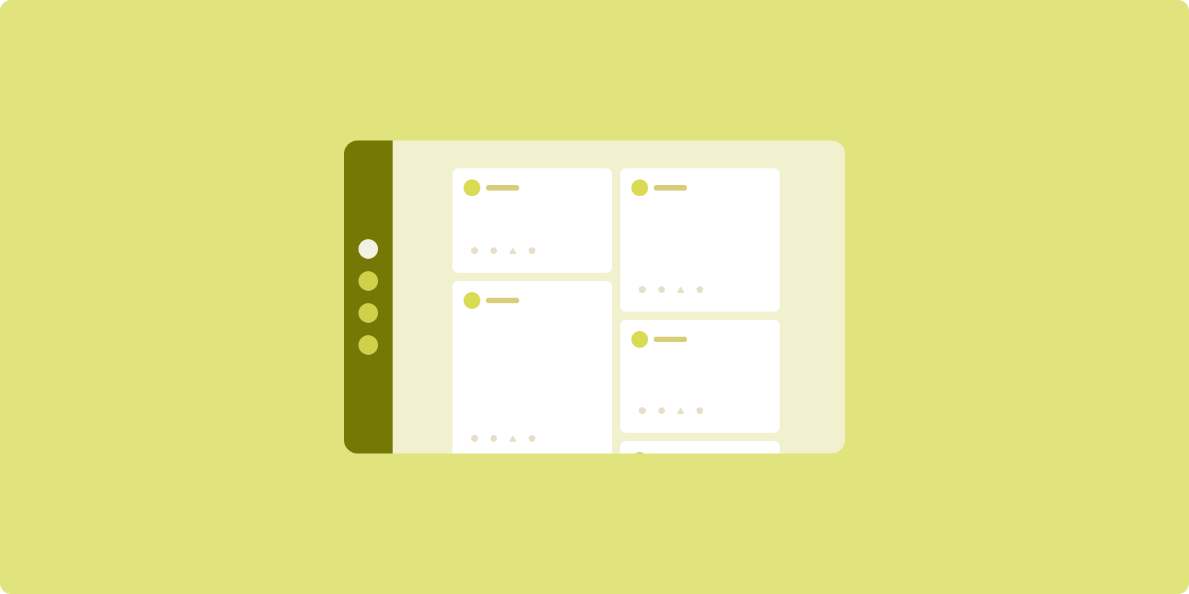
リスト詳細

リストと詳細レイアウトでは、記述や説明などの補足情報(アイテムの詳細情報)があるアイテムのリストをユーザーに表示します。
このレイアウトでは、アプリ ウィンドウが 2 つの横並びのペイン(リスト用と詳細用)に分割されます。ユーザーがリストからアイテムを選択するとそのアイテムの詳細が表示されます。詳細のディープリンクをクリックすると、詳細ペインに追加のコンテンツが表示されます。
拡大幅ディスプレイ(ウィンドウ サイズクラスを使用するを参照)では、リストと詳細を同時に表示できます。リストのアイテムを選択すると詳細ペインが更新され、選択したアイテムに関連するコンテンツが表示されます。
中程度幅ディスプレイとコンパクト幅ディスプレイでは、ユーザーによるアプリの操作に応じてリストまたは詳細のどちらかが表示されます。リストのみが表示されている場合にリストのアイテムを選択すると、リストに代わって詳細が表示されます。詳細だけが表示されているときに [戻る] ボタンを押すと、リストが再表示されます。
デバイスの向きやアプリのウィンドウ サイズなどの設定を変更すると、ディスプレイのウィンドウ サイズクラスが変更されます。リスト / 詳細レイアウトは、設定内容に応じてアプリの状態を維持しながら変更に対応します。
- リストペインと詳細ペインの両方を表示している拡大幅ディスプレイが中程度幅またはコンパクト幅に狭められた場合、詳細ペインはそのままで、リストペインが非表示になります。
- 中程度幅またはコンパクト幅のディスプレイに詳細ペインのみが表示されている場合に、ウィンドウ サイズクラスが拡大幅に広げられると、リストと詳細が一緒に表示され、リストペインは、詳細ペイン内のコンテンツに対応するアイテムが選択された状態になります。
- 中程度幅またはコンパクト幅のディスプレイでリストペインだけが表示されている状態から拡大幅に広げられた場合は、リストペインとプレースホルダの詳細ペインが同時に表示されます。
リストと詳細レイアウトは、メッセージ アプリ、連絡先管理ツール、インタラクティブなメディア ブラウザのほか、詳細情報を表示するアイテムのリストとしてコンテンツを整理できるアプリに最適です。
実装
Compose の宣言型パラダイムはウィンドウ サイズクラスのロジックをサポートしていて、リストペインと詳細ペインを同時に表示するか(ウィンドウ サイズクラスが拡大幅の場合)、リストペインまたは詳細ペインのどちらかのみを表示するか(ウィンドウ サイズクラスが中程度幅またはコンパクト幅の場合)を判断します。
データフローを単方向にするために、現在の ウィンドウサイズクラスと、選択したリストアイテム(存在する場合)の詳細を含む、すべての状態をホイスティングします。そうすることで、すべての コンポーザブルがデータにアクセスし、正しくレンダリングできるようになります。
小さいウィンドウに詳細ペインのみを表示している場合は、BackHandler
を追加して詳細ペインを削除し、リストペインのみを表示します。BackHandler は、ウィンドウ
サイズクラスと選択された詳細の状態に依存するハンドラのため、アプリ全体のナビゲーションには関与しません。
ListDetailPaneScaffold は、リストと詳細レイアウトの実装を簡素化する高レベルのコンポーザブルです。ウィンドウ
サイズクラスに基づいてペインのロジックを自動的に処理し、ペイン間のナビゲーションをサポートします。
ListDetailPaneScaffold を使用した最小限の実装を次に示します。
@OptIn(ExperimentalMaterial3AdaptiveApi::class) @Composable fun MyListDetailPaneScaffold() { val navigator = rememberListDetailPaneScaffoldNavigator() ListDetailPaneScaffold( directive = navigator.scaffoldDirective, value = navigator.scaffoldValue, listPane = { // Listing Pane }, detailPane = { // Details Pane } ) }
この例の主要コンポーネントは次のとおりです。
rememberListDetailPaneScaffoldNavigator: リストペインと詳細ペイン間のナビゲーションを管理するナビゲータを作成します。listPane: アイテムのリストを表示します。detailPane: 選択したアイテムのコンテンツを表示します。
実装例の詳細については、以下をご覧ください。
- リストと詳細レイアウトを作成する デベロッパー ガイド
- リストと詳細-作成 サンプル
フィード
フィード レイアウトは、同等のコンテンツ要素を設定可能なグリッドに配置して、大量のコンテンツをすばやく簡単に確認できるようにするレイアウトです。
サイズと位置によって、コンテンツ要素間の関係が決まります。
コンテンツ グループは、複数の要素を同じサイズにして一緒に配置したものです。近くの他の要素より大きくすることで、ユーザーの関心を引けます。
カードとリストは、フィード レイアウトの一般的なコンポーネントです。
グリッドは、スクロール可能な単一の列から複数列のフィードまで適応可能なため、フィード レイアウトは、ほぼすべてのサイズのディスプレイに対応できます。
フィードは、特にニュースアプリやソーシャル メディア アプリに適しています。
実装
フィードでは、多数のコンテンツ要素を縦方向にスクロールするコンテナに含め、グリッドに配置します。Lazy リストでは、多数のアイテムを列または行内に効率的にレンダリングできます。Lazy グリッドでは、アイテムをグリッドにレンダリングすることで、アイテムのサイズとスパンを設定しやすくなります。
利用可能な表示領域に基づいてグリッド レイアウトの列を設定し、グリッド アイテムの最小許容幅を決めます。グリッド アイテムを定義する際は、列のスパンを調整して、一部のアイテムを他のアイテムより強調することができます。
セクション ヘッダー、分割線など、フィードの幅いっぱいに表示されるようデザインしたアイテムの場合は、maxLineSpan を使用してレイアウトの幅全体を設定します。
コンパクト幅のディスプレイで複数の列を表示できるだけのスペースがない場合、LazyVerticalGrid は LazyColumn と同じ動作になります。
LazyVerticalGrid を使用した最小限の実装を次に示します。
@Composable fun MyFeed(names: List<String>) { LazyVerticalGrid( // GridCells.Adaptive automatically adapts column count based on available width columns = GridCells.Adaptive(minSize = 180.dp), ) { items(names) { name -> Text(name) } } }
アダプティブ フィードの鍵は columns 構成です。GridCells.Adaptive(minSize = 180.dp) は、各列の幅が 180.dp 以上のグリッドを作成します。グリッドには、利用可能なスペースに収まるだけの列が表示されます。
実装例については、Compose を利用したフィードのサンプルをご覧ください。
補助ペイン

補助ペイン レイアウトは、アプリのコンテンツをプライマリ表示領域とセカンダリ表示領域に分けて編成するためのものです。
プライマリ表示領域はアプリ ウィンドウの大部分(通常は約 3 分の 2)を占め、メイン コンテンツを表示します。セカンダリ表示領域は、アプリ ウィンドウの残りの部分を構成するペインで、メインのコンテンツをサポートするコンテンツを表示します。
補助ペイン レイアウトは、横向きの拡大幅ディスプレイ(ウィンドウ サイズクラスを使用するを参照)に適しています。中程度幅またはコンパクト幅のディスプレイで表示領域をプライマリとセカンダリに分けられるのは、コンテンツの表示領域が小さくなってもかまわない場合か、最初は追加のコンテンツをボトムシートまたはサイドシートに隠し、メニューまたはボタンで表示を制御できる場合です。
補助ペイン レイアウトとリスト / 詳細レイアウトの違いは、プライマリ コンテンツとセカンダリ コンテンツの関係です。リスト / 詳細レイアウトのセカンダリ ペインのコンテンツは、プライマリ コンテンツと関連していますが、たとえば、補助ペインにツール ウィンドウを表示した場合のように、補助ペイン自体はプライマリ コンテンツとは関係ありません。ただし、リスト / 詳細レイアウトの詳細ペインの補足コンテンツ(例: 商品リスティングの商品説明)は、プライマリ コンテンツがなくても意味を持ちます。
補助ペインのユースケースには、次のようなものがあります。
- 生産性向上アプリ: 補助ペインにレビューアのコメントが添付されたドキュメントまたはスプレッドシート
- メディアアプリ: 補助ペインにストリーミング動画と関連動画のリストが表示されている場合や、プレイリストが付いている音楽アルバムの説明
- ツールと設定: 補助ペインにパレット、効果、その他の設定が表示されるメディア編集ツール
実装
Compose はウィンドウ サイズクラスのロジックをサポートしているため、メイン コンテンツと補助コンテンツの両方を同時に表示するか、補助コンテンツを別の場所に配置するかを決められます。
また、現在のウィンドウ サイズクラスや、メイン コンテンツと補助コンテンツのデータに関連する情報を含む、すべての状態をホイスティングできます。
コンパクト幅ディスプレイの場合は、補助コンテンツをメイン コンテンツの下またはボトムシート内に配置します。中程度幅と拡大幅の場合は、メインコンテンツの横に補助コンテンツを配置し、表示できるスペースとコンテンツに応じて適切なサイズを設定します。中程度幅の場合は、表示領域はメインコンテンツと補助コンテンツで均等に分割されます。拡張後の幅の場合は、表示領域の 70% がメイン コンテンツに、30% が補助コンテンツに割り当てられます。
SupportingPaneScaffold は、補助ペインのレイアウトの実装を簡素化する高レベルのコンポーザブルです。このコンポーザブルは、ウィンドウ
サイズクラスに基づいてペインのロジックを自動的に処理し、大画面ではペインを並べて表示し、小画面では補助ペインを非表示にします。SupportingPaneScaffold
は、ペイン間のナビゲーションもサポートしています。
最小限の実装は次のとおりです。
@OptIn(ExperimentalMaterial3AdaptiveApi::class) @Composable fun MySupportingPaneScaffold() { // Creates and remembers a navigator to control pane visibility and navigation val navigator = rememberSupportingPaneScaffoldNavigator() SupportingPaneScaffold( // Directive and value help control pane visibility based on screen size and state directive = navigator.scaffoldDirective, value = navigator.scaffoldValue, mainPane = { // Main Pane for the primary content }, supportingPane = { //Supporting Pane for supplementary content } ) }
rememberSupportingPaneScaffoldNavigator: ペインの表示 / 非表示を管理するナビゲータを作成するコンポーザブル(コンパクト画面で補助ペインを非表示にするなど)mainPane: メイン コンテンツを表示するコンポーザブルsupportingPane: 補助コンテンツを表示するコンポーザブル
実装例の詳細については、以下をご覧ください。
- 補助ペインのレイアウトを作成する デベロッパー ガイド
- supporting-pane-compose サンプル
参考情報
- マテリアル デザイン - 正規化レイアウト