
アプリ全体でスタイルを採用する方法は 3 つあります。
Styleパラメータを公開する既存のコンポーネントで直接使用します。Styleパラメータを受け入れないレイアウト コンポーザブルにModifier.styleableを使用してスタイルを適用します。- 独自のカスタム デザイン システムでは、
Modifier.styleable{}を使用し、独自のコンポーネントでスタイル パラメータを公開します。
Styles で使用可能なプロパティ
スタイルは、修飾子がサポートするプロパティの多くをサポートしていますが、修飾子のすべてをスタイルで複製できるわけではありません。インタラクション、カスタム描画、プロパティのスタックなどの特定の動作には、修飾子が必要です。
| グループ化 | プロパティ | 子に継承される |
|---|---|---|
| レイアウトとサイズ設定 | ||
| コンテンツのパディング(内側) | - contentPadding(all: Dp)- contentPadding(horizontal: Dp, vertical: Dp)- contentPadding(start: Dp, top: Dp, end: Dp, bottom: Dp)- contentPaddingHorizontal(value: Dp) / contentPaddingVertical(value: Dp)- contentPaddingStart(value: Dp) / contentPaddingTop(value: Dp) / contentPaddingEnd(value: Dp) / contentPaddingBottom(value: Dp) |
いいえ |
| 外部パディング(外側) | - externalPadding(all: Dp)- externalPadding(horizontal: Dp, vertical: Dp)- externalPadding(start: Dp, top: Dp, end: Dp, bottom: Dp)- externalPaddingHorizontal(value: Dp) / externalPaddingVertical(value: Dp)- externalPaddingStart(value: Dp) / externalPaddingTop(value: Dp) / externalPaddingEnd(value: Dp) / externalPaddingBottom(value: Dp) |
いいえ |
| サイズ | fillWidth()/fillHeight()/fillSize() と width、height、size(Dp、DpSize、Float の分数に対応)。 |
いいえ |
| ポジショニング | left/top/right/bottom オフセット。 |
いいえ |
| Visual Appearance | ||
| 塗りつぶし | background と foreground(Color または Brush をサポート)。 |
いいえ |
| 枠線 | borderWidth、borderColor、borderBrush。 |
いいえ |
| 図形 | shape |
いいえ。ただし、他のプロパティと組み合わせて使用します。clip と border は、この定義された形状を使用します。 |
| 影 | dropShadow、innerShadow |
いいえ |
| 変換 | ||
| グラフィック レイヤの空間移動 | translationX、translationY、scaleX/scaleY、rotationX/rotationY/rotationZ |
いいえ |
| 管理 | alpha、zIndex(積み重ね順序)、transformOrigin(ピボット ポイント) |
いいえ |
| タイポグラフィ | ||
| スタイル設定 | textStyle、fontSize、fontWeight、fontStyle、fontFamily |
はい |
| 色調 | contentColor と contentBrush。これはアイコンのスタイリングにも使用されます。 |
はい |
| 段落 | lineHeight、letterSpacing、textAlign、textDirection、lineBreak、hyphens。 |
はい |
| デコレーション | textDecoration、textIndent、baselineShift。 |
はい |
Style パラメータを使用してコンポーネントにスタイルを直接適用する
Style パラメータを公開するコンポーネントでは、スタイルを設定できます。
BaseButton( onClick = { }, style = { } ) { BaseText("Click me") }
スタイル ラムダ内では、externalPadding や background などのさまざまなプロパティを設定できます。
BaseButton( onClick = { }, style = { background(Color.Blue) } ) { BaseText("Click me") }
サポートされているプロパティの一覧については、スタイルで使用可能なプロパティをご覧ください。
既存のパラメータがないコンポーネントの修飾子を使用してスタイルを適用する
組み込みのスタイル パラメータがないコンポーネントでも、styleable 修飾子を使用してスタイルを適用できます。このアプローチは、独自のカスタム コンポーネントを開発する場合にも役立ちます。
Row( modifier = Modifier.styleable { } ) { BaseText("Content") }
style パラメータと同様に、ラムダ内に background、contentPadding、externalPadding などのプロパティを含めることができます。
Row( modifier = Modifier.styleable { background(Color.Blue) } ) { BaseText("Content") }
複数の連鎖した Modifier.styleable 修飾子は、適用されたコンポーザブルの非継承プロパティと加算され、同じプロパティを定義する複数の修飾子と同様に動作します。継承されたプロパティの場合、これらはオーバーライドされ、チェーン内の最後の styleable 修飾子が値を設定します。
Modifier.styleable を使用する場合は、修飾子で使用する StyleState を作成して提供し、状態ベースのスタイルを適用することもできます。詳しくは、スタイルによる状態とアニメーションをご覧ください。
スタンドアロンのスタイルを定義する
再利用できるように、スタンドアロンの Style を定義できます。
val style = Style { background(Color.Blue) }
定義したスタイルは、コンポーザブルの style パラメータに渡すか、Modifier.styleable で渡すことができます。Modifier.styleable を使用する場合は、StyleState オブジェクトも作成する必要があります。StyleState について詳しくは、スタイルによる状態とアニメーションのドキュメントをご覧ください。
次の例は、コンポーネントの組み込みパラメータまたは Modifier.styleable を介してスタイルを直接適用する方法を示しています。
val style = Style { background(Color.Blue) } // built in parameter BaseButton(onClick = { }, style = style) { BaseText("Button") } // modifier styleable val styleState = remember { MutableStyleState(null) } Column( Modifier.styleable(styleState, style) ) { BaseText("Column content") }
この Style を複数のコンポーネントに渡すこともできます。
val style = Style { background(Color.Blue) } // built in parameter BaseButton(onClick = { }, style = style) { BaseText("Button") } BaseText("Different text that uses the same style parameter", style = style) // modifier styleable val columnStyleState = remember { MutableStyleState(null) } Column( Modifier.styleable(columnStyleState, style) ) { BaseText("Column") } val rowStyleState = remember { MutableStyleState(null) } Row( Modifier.styleable(rowStyleState, style) ) { BaseText("Row") }
複数のスタイル プロパティを追加する
各行に異なるプロパティを設定することで、複数のスタイル プロパティを追加できます。
BaseButton( onClick = { }, style = { background(Color.Blue) contentPaddingStart(16.dp) } ) { BaseText("Button") }
スタイル内のプロパティは、修飾子ベースのスタイル設定とは異なり、加算されません。スタイルは、1 つのスタイル ブロック内のプロパティのリストで最後に設定された値を取得します。次の例では、背景が 2 回設定されているため、TealColor が適用された背景になります。パディングの場合、contentPaddingTop は contentPadding で設定された上部パディングをオーバーライドし、値を結合しません。
BaseButton( style = { background(Color.Red) // Background of Red is now overridden with TealColor instead background(TealColor) // All directions of padding are set to 64.dp (top, start, end, bottom) contentPadding(64.dp) // Top padding is now set to 16.dp, all other paddings remain at 64.dp contentPaddingTop(16.dp) }, onClick = { // } ) { BaseText("Click me!") }

contentPadding オーバーライドが設定されたボタン。複数のスタイル オブジェクトをマージする
複数の Style オブジェクトを作成して、コンポーザブルの style パラメータに渡すことができます。
val style1 = Style { background(TealColor) } val style2 = Style { contentPaddingTop(16.dp) } BaseButton( style = style1 then style2, onClick = { }, ) { BaseText("Click me!") }

contentPaddingTop が設定されたボタン。複数のスタイルで同じプロパティが指定されている場合は、最後に設定されたプロパティが選択されます。スタイルではプロパティは加算されないため、最後に渡されたパディングが、最初の contentPadding で設定された contentPaddingHorizontal をオーバーライドします。また、最後の背景色は、渡された初期スタイルで設定された背景色をオーバーライドします。
val style1 = Style { background(Color.Red) contentPadding(32.dp) } val style2 = Style { contentPaddingHorizontal(8.dp) background(Color.LightGray) } BaseButton( style = style1 then style2, onClick = { }, ) { BaseText("Click me!") }
この場合、適用されるスタイルは、左右のパディングを除き、薄いグレーの背景と 32.dp のパディングになります。左右のパディングの値は 8.dp です。

contentPadding を使用し、異なるスタイルでオーバーライドされたボタン。スタイルの継承
contentColor やテキスト スタイル関連のプロパティなど、特定のスタイル プロパティは子コンポーザブルに伝播します。子コンポーザブルに設定されたスタイルは、その特定の子に対して継承された親スタイルをオーバーライドします。
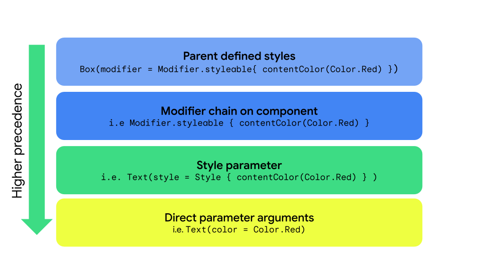
Style、styleable、直接パラメータによるスタイルの伝播。| 優先度 | メソッド | 効果 |
|---|---|---|
| 1(最高) | コンポーザブルの直接引数 | すべてをオーバーライドします(例: Text(color = Color.Red)) |
| 2 | スタイル パラメータ | ローカル スタイルのオーバーライド Text(style = Style { contentColor(Color.Red)} |
| 3 | 修飾子チェーン | Modifier.styleable{ contentColor(Color.Red) をコンポーネント自体に適用します。 |
| 4(最低) | 親スタイル | 親から渡された継承可能なプロパティ(タイポグラフィ/色)。 |
親のスタイル設定
親コンポーザブルからテキスト プロパティ(contentColor など)を設定すると、すべての子 Text コンポーザブルに伝播します。
val styleState = remember { MutableStyleState(null) } Column( modifier = Modifier.styleable(styleState) { background(Color.LightGray) val blue = Color(0xFF4285F4) val purple = Color(0xFFA250EA) val colors = listOf(blue, purple) contentBrush(Brush.linearGradient(colors)) }, ) { BaseText("Children inherit", style = { width(60.dp) }) BaseText("certain properties") BaseText("from their parents") }

プロパティの子オーバーライド
特定の Text コンポーザブルにスタイルを設定することもできます。親コンポーザブルにスタイルが設定されている場合、子コンポーザブルに設定されたスタイルは親コンポーザブルのスタイルをオーバーライドします。
val styleState = remember { MutableStyleState(null) } Column( modifier = Modifier.styleable(styleState) { background(Color.LightGray) val blue = Color(0xFF4285F4) val purple = Color(0xFFA250EA) val colors = listOf(blue, purple) contentBrush(Brush.linearGradient(colors)) }, ) { BaseText("Children can ", style = { contentBrush(Brush.linearGradient(listOf(Color.Red, Color.Blue))) }) BaseText("override properties") BaseText("set by their parents") }

カスタム スタイル プロパティを実装する
次の例に示すように、StyleScope の拡張関数を使用して、既存のスタイル定義にマッピングするカスタム プロパティを作成できます。
fun StyleScope.outlinedBackground(color: Color) { border(1.dp, color) background(color) }
この新しいプロパティを Style 定義内で適用します。
val customExtensionStyle = Style { outlinedBackground(Color.Blue) }
新しいスタイル設定可能なプロパティの作成はサポートされていません。ユースケースでこのようなサポートが必要な場合は、機能リクエストを送信してください。
CompositionLocal の値を読み取る
デザイン システム トークンを CompositionLocal 内に保存して、パラメータとして渡すことなく変数にアクセスするのは一般的なパターンです。スタイルは CompositionLocal にアクセスして、スタイル内のシステム全体の値を取得できます。
val buttonStyle = Style { contentPadding(12.dp) shape(RoundedCornerShape(50)) background(Brush.verticalGradient(LocalCustomColors.currentValue.background)) }