
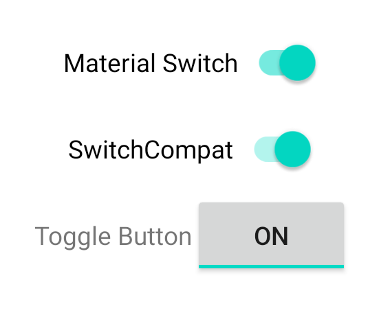
Wenn Sie ein View-basiertes Layout verwenden, gibt es drei Hauptoptionen zum Implementieren von Schaltern. Wir empfehlen die Verwendung der
SwitchMaterial Komponente
aus der Material
Components-Bibliothek:
<androidx.constraintlayout.widget.ConstraintLayout xmlns:android="http://schemas.android.com/apk/res/android"
    xmlns:app="http://schemas.android.com/apk/res-auto"
    android:layout_width="match_parent"
    android:layout_height="match_parent"
    android:padding="16dp">

    <com.google.android.material.switchmaterial.SwitchMaterial
        android:id="@+id/material_switch"
        android:layout_width="wrap_content"
        android:layout_height="wrap_content"
        android:text="@string/material_switch"
        app:layout_constraintEnd_toEndOf="parent"
        app:layout_constraintStart_toStartOf="parent"
        app:layout_constraintTop_toTopOf="parent" />

</androidx.constraintlayout.widget.ConstraintLayout>
In älteren Apps wird möglicherweise noch die ältere
SwitchCompat AppCompat
Komponente verwendet, wie im folgenden Beispiel gezeigt:
<androidx.constraintlayout.widget.ConstraintLayout xmlns:android="http://schemas.android.com/apk/res/android"
    xmlns:app="http://schemas.android.com/apk/res-auto"
    android:layout_width="match_parent"
    android:layout_height="match_parent"
    android:padding="16dp">

    <androidx.appcompat.widget.SwitchCompat
        android:id="@+id/switchcompat"
        android:layout_width="wrap_content"
        android:layout_height="wrap_content"
        android:text="@string/switchcompat"
        app:layout_constraintEnd_toEndOf="parent"
        app:layout_constraintStart_toStartOf="parent"
        app:layout_constraintTop_toTopOf="parent" />

</androidx.constraintlayout.widget.ConstraintLayout>
Das folgende Beispiel zeigt
AppCompatToggleButton,
eine weitere ältere Komponente mit einer deutlich anderen UI:
<androidx.constraintlayout.widget.ConstraintLayout xmlns:android="http://schemas.android.com/apk/res/android"
    xmlns:app="http://schemas.android.com/apk/res-auto"
    android:layout_width="match_parent"
    android:layout_height="match_parent"
    android:padding="16dp">

    <TextView
        android:id="@+id/toggle_button_label"
        android:layout_width="wrap_content"
        android:layout_height="wrap_content"
        app:layout_constraintStart_toStartOf="parent"
        app:layout_constraintEnd_toStartOf="@id/toggle"
        app:layout_constraintHorizontal_chainStyle="packed"
        app:layout_constraintBaseline_toBaselineOf="@id/toggle"
        android:text="@string/toggle_button" />

    <androidx.appcompat.widget.AppCompatToggleButton
        android:id="@+id/toggle"
        android:layout_width="wrap_content"
        android:layout_height="wrap_content"
        app:layout_constraintEnd_toEndOf="parent"
        app:layout_constraintStart_toEndOf="@id/toggle_button_label"
        app:layout_constraintTop_toTopOf="parent"
        app:layout_constraintBottom_toBottomOf="parent"/>

</androidx.constraintlayout.widget.ConstraintLayout>
Diese drei Komponenten bieten dasselbe Verhalten, sehen aber unterschiedlich aus. Die Unterschiede zwischen SwitchMaterial und SwitchCompat sind gering, aber AppCompatToggleButton unterscheidet sich deutlich:
Statusänderungen verarbeiten
SwitchMaterial, SwitchCompat und AppCompatToggleButton sind alle Unterklassen
von CompoundButton, wodurch
sie einen gemeinsamen Mechanismus zum Verarbeiten von Änderungen des ausgewählten Status erhalten. Sie implementieren
eine Instanz von
CompoundButton.OnCheckedChangeListener
und fügen sie dem Button hinzu, wie im folgenden Beispiel gezeigt:
Kotlin
class MainActivity : AppCompatActivity() {
    override fun onCreate(savedInstanceState: Bundle?) {
        super.onCreate(savedInstanceState)

        val binding: SwitchLayoutBinding = SwitchLayoutBinding.inflate(layoutInflater)
        setContentView(binding.root)

        binding.materialSwitch.setOnCheckedChangeListener { _, isChecked ->
            if (isChecked) {
                // The switch is checked.
            } else {
                // The switch isn't checked.
            }
        }
    }
}
Java
public class MainActivity extends AppCompatActivity {

    @Override
    protected void onCreate(Bundle savedInstanceState) {
        super.onCreate(savedInstanceState);

        SwitchLayoutBinding binding = SwitchLayoutBinding.inflate(getLayoutInflater());
        setContentView(binding.getRoot());

        binding.materialSwitch.setOnCheckedChangeListener((buttonView, isChecked) -> {
            if (isChecked) {
                // The switch is checked.
            } else {
                // The switch isn't checked.
            }
        });
    }
}
CompoundButton.OnCheckedChangeListener ist eine Schnittstelle mit einer einzelnen abstrakten Methode
(Single Abstract Method, SAM), daher können Sie sie als Lambda-Ausdruck implementieren. Der Lambda-Ausdruck wird immer aufgerufen, wenn sich der ausgewählte Status ändert. Der Wert des booleschen Werts isChecked, der an den Lambda-Ausdruck übergeben wird, gibt den neuen ausgewählten Status an.