
In Jetpack Compose Glimmer, the color system is designed for additive displays
and real environments. Unlike standard Android themes, the Colors in
GlimmerTheme prioritize dark backgrounds with semi-transparency and vibrant
accents to ensure content is legible against unpredictable real-world lighting.
The system uses a three-part palette with primary, secondary, and neutral colors. Neutral colors often serve as the physical surfaces of the spatial UI, while the primary and secondary colors provide clear visual cues for interaction and branding.
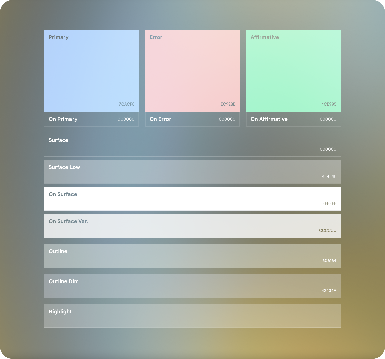
Note that "On ..." colors such as On Surface aren't exposed through
GlimmerTheme. These colors are automatically calculated by the system based on
the background color.
However, the other colors are exposed through GlimmerTheme.colors, with
values for each color role as described in the following table:
Color role |
Defaults |
|---|---|
primary |
#79ACFE |
secondary |
#4C88E9 |
positive |
#58FFA5 |
negative |
#FF8981 |
background |
|
surface |
#303030 |
outline |
#CBC9C8 |
outlineVariant |
#42434A |
Note that while background, surface, outline, and
outlineVariant are marked as customizable, we strongly recommend that you
don't customize these values.