
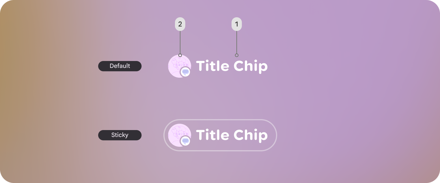
Jetpack Compose Glimmer에서 TitleChip 구성요소는
구성요소는 Card 또는 VerticalList과 같은 연결된 콘텐츠에 간단한 컨텍스트 또는 라벨을 제공하는 비상호작용
입니다.
짧은 제목, 카테고리 이름 또는 상태 표시기와 같은 간결한 정보에 제목 칩을 사용합니다. 일반적으로 제목 칩은 설명하는 콘텐츠 위에 배치하여 명확한 구조적 관계를 설정해야 합니다.
기본 예: 짧은 제품명 칩 만들기
다음 코드는 기본 제목 칩을 만듭니다.
@Composable fun TitleChipSample() { TitleChip { Text("Messages") } }
Example: Create a title chip with a card
To use a title chip with another component, place the title chip
TitleChipDefaults.associatedContentSpacing above the other component in
the composable. The following code creates a title chip with a card:
@Composable fun TitleChipWithCardSample() { Column(horizontalAlignment = Alignment.CenterHorizontally) { TitleChip { Text("Title Chip") } Spacer(Modifier.height(TitleChipDefaults.associatedContentSpacing)) Card( title = { Text("Title") }, subtitle = { Text("Subtitle") }, leadingIcon = { Icon(FavoriteIcon, "Localized description") }, ) { Text("Card Content") } } }
코드 관련 핵심 사항
- 제목 칩은 가로로 가운데 정렬됩니다. 이는 카드 위에 배치된 제목 칩의 일반적인 정렬입니다.
Spacer의 높이는 고정되어 있어 두 구성요소 간에 적절한 세로 간격을 제공합니다. 이는TitleChipDefaults.associatedContentSpacing을 사용하여 정의됩니다.- 선택적
leadingIcon을 사용하여 텍스트 콘텐츠 앞에 시각적 컨텍스트를 추가합니다. - 제목 칩은 텍스트에
caption스타일을 자동으로 사용합니다. - 제목 칩은 상호작용하지 않습니다. 클릭 가능한 라벨이 필요한 경우 a
Button또는 다른 상호작용 구성요소를 사용합니다.