
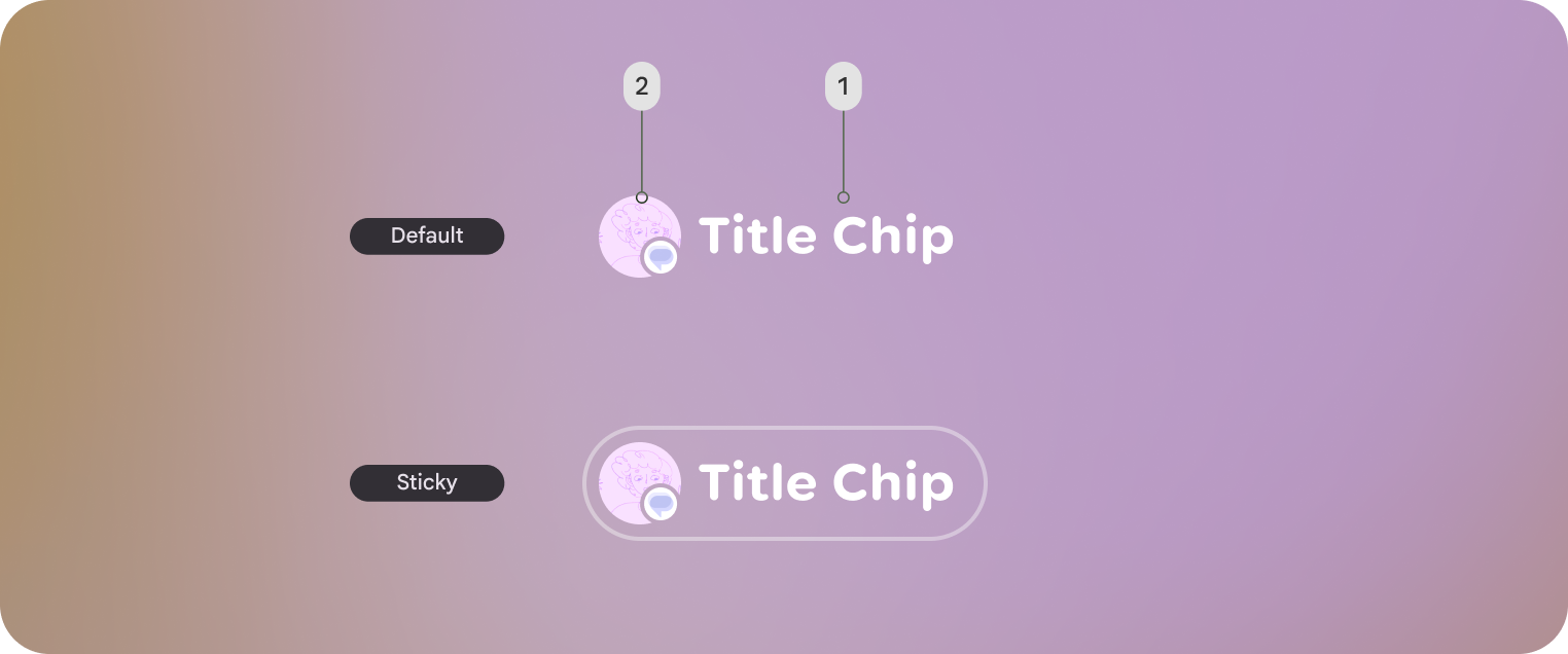
Jetpack Compose Glimmer の TitleChip コンポーネントは、非インタラクティブ
コンポーネントで、Card や VerticalList などの関連コンテンツの簡単なコンテキストやラベルを提供します。
タイトルチップは、短いタイトル、カテゴリ名、ステータス インジケーターなどの簡潔な情報に使用します。通常、タイトルチップは、説明するコンテンツの上に配置して、明確な構造関係を確立する必要があります。
基本的な例: 短いタイトルチップを作成する
次のコードは、基本的なタイトルチップを作成します。
@Composable fun TitleChipSample() { TitleChip { Text("Messages") } }
Example: Create a title chip with a card
To use a title chip with another component, place the title chip
TitleChipDefaults.associatedContentSpacing above the other component in
the composable. The following code creates a title chip with a card:
@Composable fun TitleChipWithCardSample() { Column(horizontalAlignment = Alignment.CenterHorizontally) { TitleChip { Text("Title Chip") } Spacer(Modifier.height(TitleChipDefaults.associatedContentSpacing)) Card( title = { Text("Title") }, subtitle = { Text("Subtitle") }, leadingIcon = { Icon(FavoriteIcon, "Localized description") }, ) { Text("Card Content") } } }
コードに関する主なポイント
- タイトルチップは水平方向に中央揃えになっています。これは、カードの上に配置されたタイトルチップの通常の配置です。
Spacerの高さは固定されており、2 つのコンポーネント間に適切な垂直方向の 間隔が設けられています。これはTitleChipDefaults.associatedContentSpacingを使用して定義されます。- 省略可能な
leadingIconを使用して、テキスト コンテンツの前に視覚的なコンテキストを追加します。 - タイトルチップのテキストには、自動的に
captionスタイルが使用されます。 - タイトルチップはインタラクティブではありません。クリック可能なラベルが必要な場合は、
Buttonまたは別のインタラクティブ コンポーネントを使用します。